Have a good day, everybody,
in today’s episode, we’re going to focus on how we’re using brand symbols to grab shoppers’ attention in communications. The following insights are based on analyses we at Designcheck.ai have conducted over the past few months on dozens of marketing materials such as POSMs, billboards and online banners.
Attention in terms of working with the brand
Neuromarketing teaches us about the importance of working with the subconscious mind, which influences 95% of our brain activity, including decision making. One of the key things in communications is to deliver consistent key brand elements to consumers at a subconscious level, making it easier for them to navigate and make decisions in stores, eshops or other key touch points. We have seen a high percentage of well-crafted materials in this area.

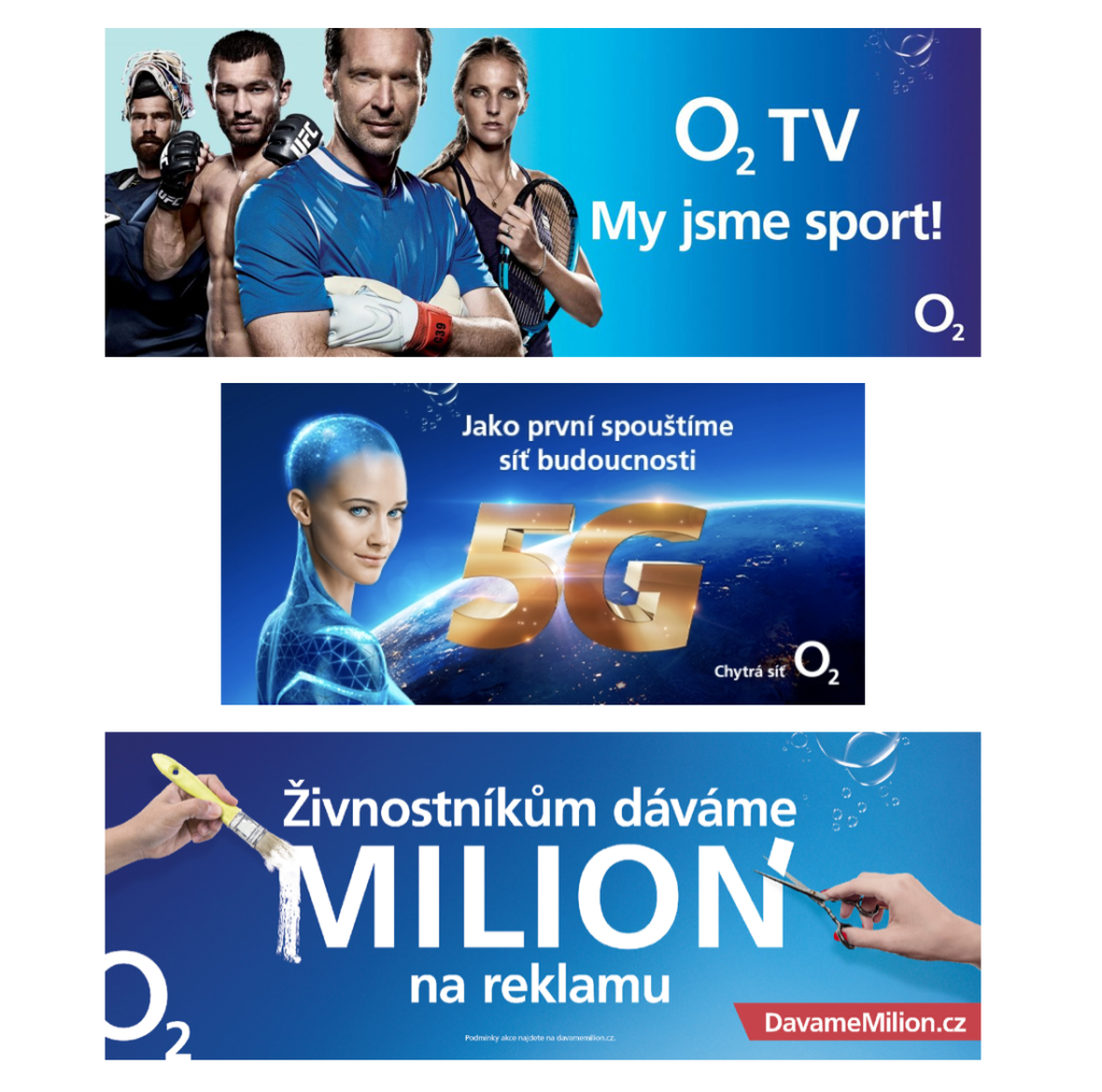
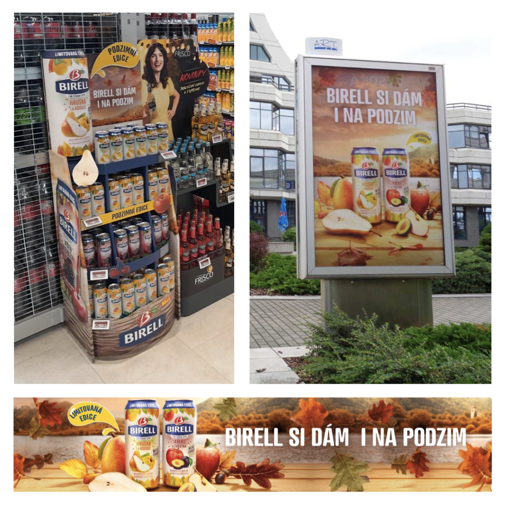
One of the opportunities we see in terms of attention and brand work is the consistency of the upcoming design with the overall 360° campaign. What we mean by this is the ability to transfer the key brand elements and key elements of the upcoming campaign into all marketing materials throughout the customer journey. Practical advice in this area might be as follows: take a step back and always check the upcoming graphic against the key marketing materials of the 360° campaign, identify the key brand and upcoming campaign symbols, and check that we have used them in our graphic.
Of course, this doesn’t mean that we have to opt for a copy-paste approach, as each communication channel can fulfil a different purpose within the customer journey – in terms of message, scope of information, different formats or ways of interaction. Nevertheless, we should always keep the key elements of a marketing campaign consistent throughout the customer journey, making it easier for consumers to recognise and make decisions at a subconscious level.

Attention and the number of graphic elements
The area where we find the most opportunity to improve designs in terms of capturing customer attention is the use of a high number of graphic elements or text. We will focus on this area in the next episode.
I look forward to seeing you soon,
Honza from Designcheck.ai

